library(dplyr)
library(forcats)
set.seed(12345)

n <- 1000

data <- data.frame(
  age = c(sample(60:89, n/2, replace = TRUE), sample(45:74, n/2, replace = TRUE)),
  treatment = rep(c("Treatment A", "Treatment B"), each = n/2),
  sex = sample(c("Male", "Female"), n, replace = TRUE),
  diabetes = sample(0:1, n, replace = TRUE)
) %>%
  # Shuffle the rows to mix Treatment A and Treatment B groups
  slice_sample(n = n) %>%
  # Generate follow-up time, depending on treatment group and age.
  mutate(follow_up_time = round(ifelse(treatment == "Treatment A",
                                       rexp(n, rate = 1 / (1200 - (age - 45) * 4)),
                                       rexp(n, rate = 1 / (1200 - (age - 45) * 8)))),
         follow_up_time = ifelse(follow_up_time == 0, 1, follow_up_time),
         follow_up_years = follow_up_time / 365.25,
         # Event probability increases with age
event = rbinom(n, 1, prob = plogis((age - 45) / 10)))In this post, I will demonstrate how to use the mexhaz package to estimate regression-standardized survival curves. In future posts, I will also cover how to achieve this using the rstpm2, stdReg, and marginaleffects packages for various outcome measures, including in a competing risk setting.
First, let’s discuss what regression standardization is and why it is useful. As you may know, a common method to analyze and visualize survival data is by constructing a Kaplan-Meier curve. Since Kaplan-Meier estimates are crude, these curves are often combined with a hazard ratio from a Cox regression to determine if there is a statistically significant difference in survival between treatment groups.
One way to provide “adjusted” survival curves is by stratifying, i.e., creating several Kaplan-Meier curves based on a categorical variable, such as age over or under 50. While this approach might be appropriate in certain cases, it is not feasible to adjust for many covariates this way or for continuous covariates, as it would produce numerous curves with very few patients represented in each.
Another option is to calculate a survival curve from a hazard model, such as Cox regression. This involves fitting a model and using it to predict a survival curve at different follow-up times. For example, we could predict survival for a 50-year-old man with Treatment A and diabetes, and then draw the same curve for a 50-year-old man with Treatment B and diabetes. Although this estimates survival for a particular individual, it is incorrect to assume that using mean values (such as mean age) will yield a mean effect estimate for the population under study. To estimate the treatment effect in the population, we can instead use regression standardization.
This involves fitting a hazard model using the entire population. We then predict survival for each individual in the study under the alternative treatment options. First, we re-code everyone to have received Treatment A and predict individual estimates. Next, we assign everyone to have received Treatment B and predict individual estimates. Finally, we average the estimates at each time point within the group to obtain population mean estimates.
Now, let’s implement this in R. We will start by simulating a dataset of 1000 patients with Treatment A or B, with or without diabetes, who either died or survived during follow-up.
Let’s do a regular Kaplan-Meier analysis first.
library(survival)
library(ggsurvfit)
Loading required package: ggplot2library(ggpubr)
myCols <- c("Difference" = "#7570b3",
"Treatment A" = "#1b9e77",
"Treatment B" = "#e7298a")
survfit2(Surv(follow_up_years, event) ~ treatment, data = data) %>%
ggsurvfit(key_glyph = "rect", linewidth = 0.8) +
add_pvalue(location = "annotation") +
scale_ggsurvfit(x_scales = list(limits = c(0, 10),
breaks = seq(0, 10, by = 2))) +
theme_pubr() +
add_risktable() +
scale_color_manual(aesthetics = c("fill", "color"),
values = myCols,
breaks = c("Treatment B", "Treatment A"))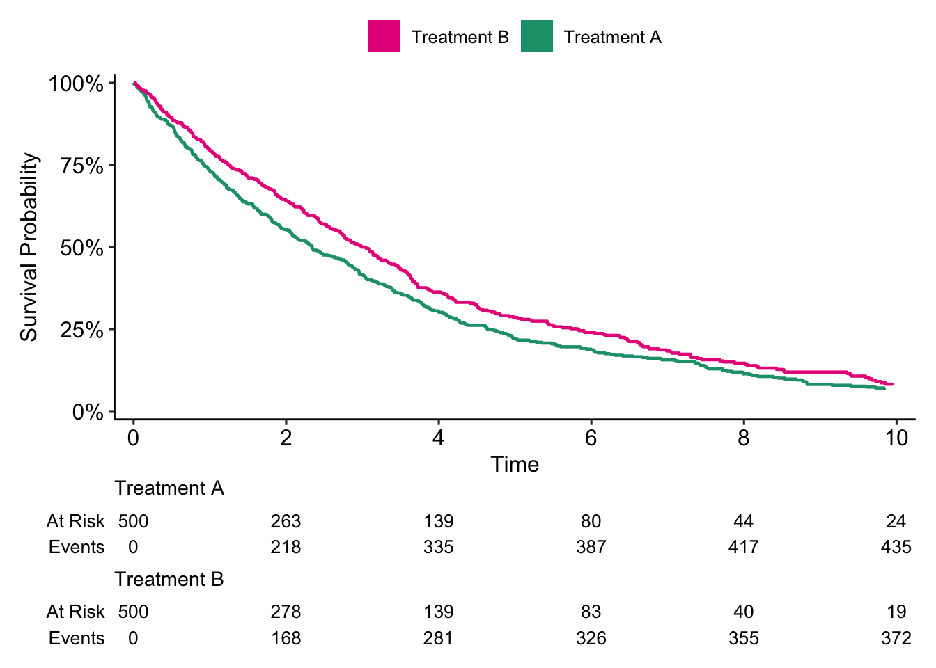
Here it seems like patients who received Treatment B had better survival compared to patients who received Treatment A (p = 0.006).
coxph(Surv(follow_up_years, event) ~ treatment + age + diabetes, data = data)Call:
coxph(formula = Surv(follow_up_years, event) ~ treatment + age +
diabetes, data = data)
coef exp(coef) se(coef) z p
treatmentTreatment B 0.196873 1.217589 0.091265 2.157 0.031
age 0.026941 1.027308 0.004122 6.536 6.32e-11
diabetes 0.108292 1.114373 0.069194 1.565 0.118
Likelihood ratio test=53.02 on 3 df, p=1.819e-11
n= 1000, number of events= 843 After adjusting for age using Cox regression, we now see that Treatment B is associated with an increased risk of death compared to Treatment A (HR: 1.22, p = 0.03). Not let’s analyse this using regression standardization. First, we fit a hazard model using the mexhaz() function. To read more about the various arguments, see ?mexhaz.
library(mexhaz)

knots <- quantile(data$follow_up_years, probs=c(1/3,2/3))
mexmod <- mexhaz(Surv(follow_up_years, event) ~ treatment + age + diabetes,
                 data = data,
                 base = "exp.bs",
                 degree = 3,
                 knots = knots,
                 verbose = 0,
                 print.level = 0)
Data
 Name N.Obs.Tot N.Obs N.Events N.Clust
 data      1000  1000      843       1

Details
 Iter Eval   Base Nb.Leg Nb.Aghq Optim Method Code    LogLik Total.Time
    5    8 exp.bs     20      10   nlm    ---    1 -1950.525      0.037
Next, we use the adjsurv function to perform the regression standardization.
adjsurv_mexhaz <- adjsurv(mexmod, time.pts = seq(0.25, 15, by = 0.25),
                          data = transform(data, treatment = "Treatment A"),
                          data.0 = transform(data, treatment = "Treatment B"))

surv_plot_data <- tibble(time = adjsurv_mexhaz$results$time.pts,
                  Est = adjsurv_mexhaz$results$adj.surv,
                  L = adjsurv_mexhaz$results$adj.surv.sup,
                  U = adjsurv_mexhaz$results$adj.surv.inf,
                  treatment = "Treatment A") %>%
  bind_rows(tibble(time = adjsurv_mexhaz$results$time.pts,
                   Est = adjsurv_mexhaz$results$adj.surv.0,
                   L = adjsurv_mexhaz$results$adj.surv.0.sup,
                   U = adjsurv_mexhaz$results$adj.surv.0.inf,
                   treatment = "Treatment B")) %>%
  mutate(treatment = as.factor(treatment))

surv_diff_plot_data <- tibble(time = adjsurv_mexhaz$results$time.pts,
                   diff = adjsurv_mexhaz$results$diff.adj.surv,
                   L = adjsurv_mexhaz$results$diff.adj.surv.inf,
                   U = adjsurv_mexhaz$results$diff.adj.surv.sup)
Let’s plot the results.
surv_fig <- surv_plot_data %>% ggplot(aes(x = time, y = Est)) +
  geom_line(aes(col = treatment)) +
  geom_ribbon(aes(ymin = L, ymax = U, fill = treatment), alpha = 0.6) +
  scale_y_continuous(labels = scales::label_percent(accuracy = 1)) +
  theme_pubr() +
  labs(x = "Time (years)") +
  theme(axis.title.y = element_blank(),
        legend.title = element_blank(),
        legend.position.inside = c(0.85, 0.85),
        text = element_text(size = 25)) +
  scale_color_manual(aesthetics = c("fill", "color"), values = myCols)


diff_fig <- surv_diff_plot_data %>% ggplot(aes(x = time, y = diff)) +
  geom_line(col = myCols["Difference"]) +
  geom_ribbon(aes(ymin = L, ymax = U), alpha = 0.6, fill = myCols["Difference"]) +
  geom_hline(yintercept = 0, linetype = 2) +
  scale_y_continuous(labels = scales::label_percent(accuracy = 1)) +
  theme_pubr() +
  labs(x = "Time (years)") +
  theme(axis.title.y = element_blank(),
        legend.title = element_blank(),
        legend.position.inside = c(0.8, 0.8),
        text = element_text(size = 25))


surv_comb <- ggarrange(surv_fig, diff_fig, ncol = 1)
surv_comb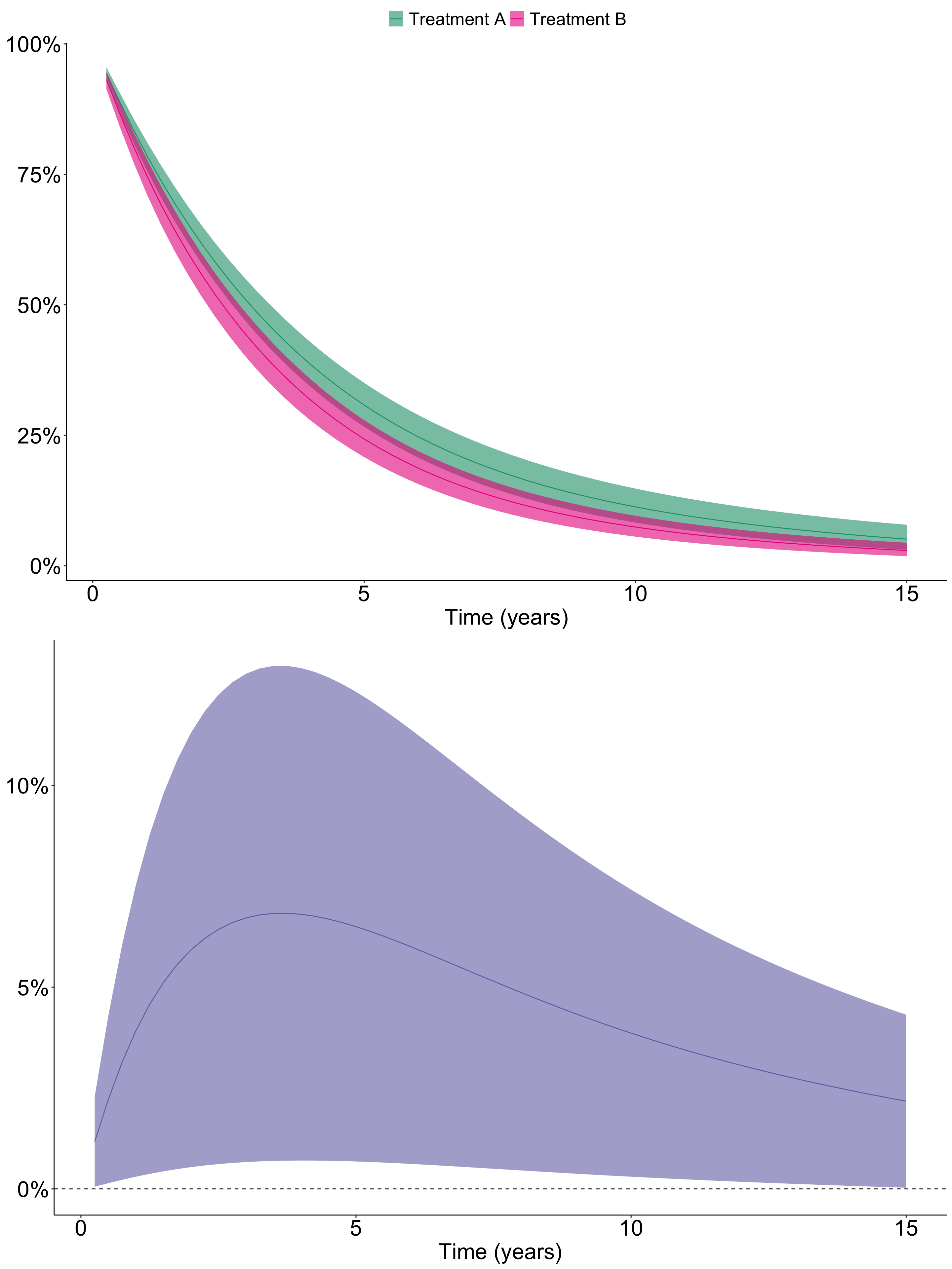
The lower figure plots the estimated difference in survival between Treatment A and Treatment B. The solid line represents the point estimate, and the shaded area indicates the 95% confidence interval. Since the difference does not cross the 0-line, we can reject the null hypothesis that there is no difference (i.e., the difference is zero).
This approach offers several advantages over simply reporting the hazard ratio (HR) from a Cox model. It provides estimates throughout the follow-up period, making it easier to interpret the treatment effect. Additionally, we can visualize how the difference evolves over time, often showing a trend toward a smaller difference at the end of the follow-up.
This example demonstrates a straightforward way to perform regression standardization. However, in a real analysis, one must consider various factors, such as model specification (e.g., variable selection, non-linear terms, interaction terms), handling of missing data, and the appropriateness of the method for the specific setting.
In the next post, we will explore how to achieve regression standardization using the rstpm2 package.